
The last time I sat in on a support-ticket review, the top three ticket categories for that client were all documented. Every single one. The answers existed, in a 90-page PDF, behind a link in a footer, in a section called “Advanced Configuration.”
Nobody found them. So the company paid a human being to retype the same three answers a few hundred times a month.
That’s the real failure mode of user documentation. Not that it doesn’t exist, but that it exists in a shape nobody can retrieve. I build retrieval systems and AI agents for a living at SoftBrixAI, which means I spend a lot of my week reading other people’s manuals as raw material: chunking them, embedding them, watching them fail to answer questions they technically contain. You learn very fast which manuals were written by someone who imagined a reader, and which were written to close a Jira ticket.
This user manual guide is what I’d hand a team before they start writing. What goes in, how to structure it, how to test it, and how to tell whether it’s working after you ship it.
What Is a User Manual?
A user manual is a document that tells an end user how to set up, operate, troubleshoot, and maintain a product, software system, or piece of equipment. It combines step-by-step instructions, safety warnings, diagrams, and reference material so people can solve problems without contacting support. Manuals ship in print, PDF, web, or in-product form, often several at once (where leveraging warmup cache requests ensures web-hosted documentation loads instantaneously for first-time visitors).
The part most teams get wrong: a user manual isn’t read front to back. It’s a reference that gets entered at a random page, mid-panic, usually on a phone. Design for the person who arrives at section 7.3 with no context, because that’s every reader.
User Manual vs User Guide vs Instruction Manual
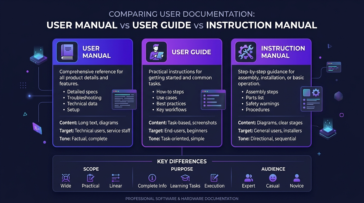
Honestly? In everyday usage these three terms are treated as synonyms, and arguing about it in a kickoff meeting is a waste of an hour. But they do carry different connotations in practice, and if you’re producing documentation for a regulated product, the distinctions start to matter.
| User Manual | User Guide | Instruction Manual | |
|---|---|---|---|
| Scope | Complete reference for the whole product | Task-focused help for specific goals | Operating a product as intended |
| Depth | Deep: includes specs, maintenance, warranty | Shallow and fast: get the job done | Moderate: assembly and safe operation |
| Typical length | Long, sectioned, indexed | Short, often a single workflow | Medium, heavy on diagrams |
| Common format | PDF, print, help centre | Web page, in-app, knowledge base | Printed booklet, QR-linked PDF |
| Usual home | Software, equipment, appliances | SaaS, apps, internal systems | Physical consumer products |
| Reader mindset | ”Where’s the setting for X?" | "How do I finish this task?" | "How do I assemble this safely?” |
A practical rule I use: if the document is organised around the product, it’s a manual. If it’s organised around the user’s task, it’s a guide. An instruction manual is a manual that leans hard on safety and assembly. Most teams should be writing guides and calling them manuals - which is fine, as long as the task-orientation survives the naming.
Why a Weak Manual Costs You More Than You Realise
The cost never shows up on a line item called “documentation.” It shows up in headcount, churn, and legal exposure.
It Cuts Down Repeat Support Tickets
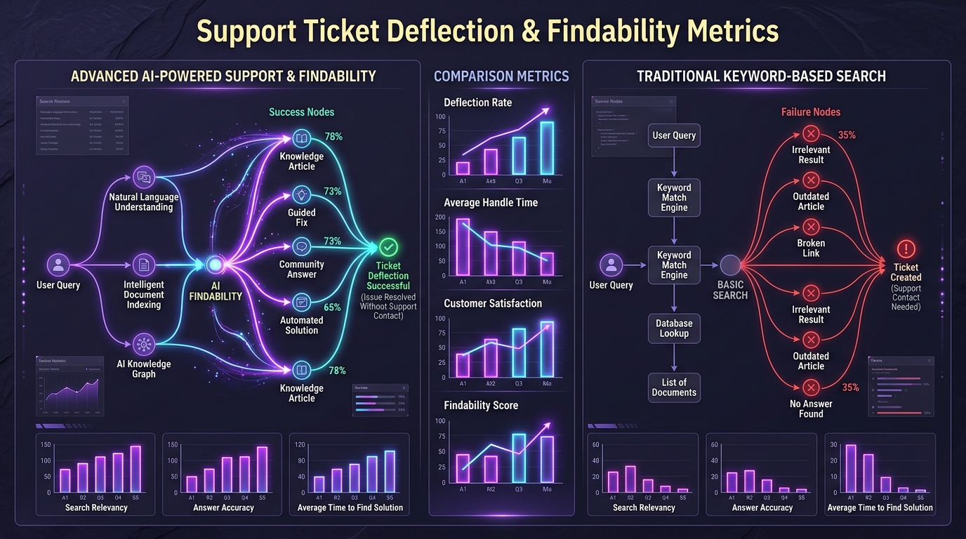
People want to solve their own problems. Zendesk’s Customer Experience Trends research found 69% of customers want to resolve as many issues as possible on their own using self-service options, and 83% of CX leaders expect a five-fold increase in self-service interactions. That demand is already there. If your manual can’t absorb it, your support queue does.
Here’s what actually happens in the ticket data, though, and it’s the part that surprised me the first time I looked closely: deflection isn’t driven by coverage. It’s driven by findability. Clients I’ve worked with usually already document 80–90% of their repeat tickets. The tickets keep coming because the answer is buried in a paragraph under a heading that doesn’t match the words a frustrated user types.
It Gets New Users Productive Faster
Time-to-first-success is the metric that predicts retention for almost every product I’ve seen instrumented. A manual that front-loads a genuine quick start guide - not a feature tour, an actual “do this one thing and see it work” path, pulls that number down. A manual that opens with a nine-page overview of the system architecture pushes it up.
It Protects You Legally and Keeps Users Safe
For anything with moving parts, current, chemicals, or heat, the manual is a legal artefact. Safety instructions, warning labels, and residual-risk disclosures are what a regulator or a plaintiff’s expert reads first. Get a competent compliance review: I’m a systems architect, not your counsel, and this is one area where “we’ll figure it out later” turns expensive.
It Shapes How People Judge Your Product
A sloppy manual makes a good product feel unfinished. Users can’t evaluate your codebase, so they evaluate the artefacts they can see. Inconsistent terminology in a manual reads, to a customer, exactly like inconsistency in the product.
Types of User Manuals and When Each One Fits
Different jobs, different documents. Trying to serve all of these in one file is the most common structural mistake I see.
Product and Instruction Manuals
Physical goods. Assembly, safe operation, labelled parts, care. Heavy on diagrams and illustrations, light on prose. If someone has to read a paragraph to understand which screw goes where, the diagram failed.
Software and App Documentation
Task-based, screenshot-driven, versioned. The hardest type to keep current, because the UI moves under you (especially when teams ship rapidly using adaptive software development). Anything that names a menu path is a maintenance liability: I’ll come back to this.
Installation and Setup Guides
Narrow and sequential. Prerequisites, environment requirements, verification step. Always end an installation guide with a way to confirm it worked. “You should now see a green status indicator” saves more tickets than the previous ten steps combined.
Training and Onboarding Manuals
Built for learning, not reference. These are the one type you can assume gets read in order. Different structure, different tone, different success metric: completion rather than lookup speed.
Standard Operating Procedure (SOP) Manuals
Internal. Manufacturing, healthcare, information technology operations. SOPs need version control, approval sign-off, and an owner. An SOP manual with no named owner rots within two quarters, guaranteed.
Service and Maintenance Manuals
For technicians, not end users. You can use jargon here - in fact, you should. Writing down to a trained field engineer wastes their time and yours.
Policy and Compliance Manuals
Organisational rules and procedures. These get audited, so traceability matters more than readability. Date every clause.
What Goes Inside a User Manual
Not every manual needs every section. But when a section is missing, it’s usually one of these, and it’s usually the troubleshooting one.
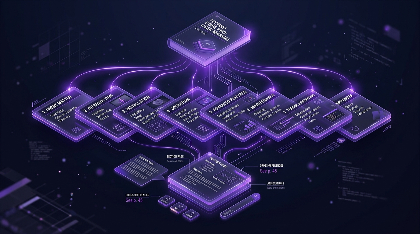
Title Page, Version Number, and Contents
Product name, model, document version, date, and a table of contents. Version number on the title page and every footer. I’ve watched a field technician work off a manual two revisions out of date because nothing on the page told him.
Introduction and Who the Manual Is For
Two paragraphs, no more. What the product does, who this document is written for, and what the reader will be able to do by the end. If your manual serves both administrators and end users, say so here and split the sections clearly.
Product Overview and Parts Breakdown
A labelled diagram beats three pages of description. Name every part exactly as it’s named everywhere else - on the packaging, in the UI, in the support macros. Entity consistency isn’t a style preference; it’s how people search.
Safety Warnings and Cautions
Distinguish severity levels and use them consistently. Place the warning immediately before the step that creates the hazard, not in a block at the front nobody reads. A warning three pages away from the dangerous action is decoration.
Setup and First-Time Use
The quick start guide lives here. Shortest path from box (or signup) to first working outcome. Cut everything optional.
Core Operating Instructions
The bulk of the manual, organised by task. One task per section. Sequential steps, one action per step, expected result stated.
Troubleshooting Section
Index this by symptom, not by cause. Users don’t know the cause - that’s why they’re reading. “Device won’t power on” is a heading someone can find. “Power supply undervoltage protection engaged” is a heading only your engineers would search for. Include both, with the symptom as the entry point.
Maintenance and Care
Schedules, intervals, consumables, cleaning. For equipment, a simple maintenance table earns its space. For software, this is where backup, log rotation, and update procedures go.
Warranty, Support Contacts, and Glossary
Warranty terms, how to reach support, and a glossary defining every symbol, icon, and error code used in the document. Define these early too: an unexplained icon on page 4 that’s only decoded in an appendix is a small cruelty.
How to Write a User Manual
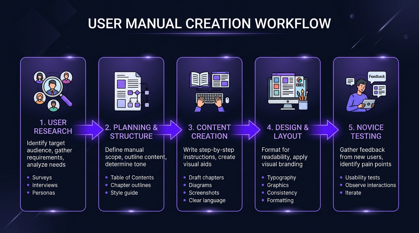
This is the process I’d follow, roughly in order. It’s less linear in practice, and that’s fine.
Start With the User, Not the Product
Write down who reads this and what they already know. A field technician, a first-time consumer, and an IT administrator need three different documents. Pick one primary reader per document and accept that you’re underserving the others: that’s better than serving nobody.
The failure I see constantly: the manual is written by the person who built the thing, and it’s structured the way the system is structured. Modules, subsystems, settings menus. That’s an architecture diagram wearing a manual’s clothes.
Map the Tasks People Actually Need to Finish
Pull real data before writing a word. Support ticket subjects, search queries from your existing help centre, sales-call objections, the questions in your community forum. That list is your table of contents. I’d rather write from a ranked list of 40 real questions than from a feature spec.
Pull Accurate Information From Your Product Team
Sit with engineering and get the edge cases - the things that break, the undocumented dependencies, the “oh yeah, that only works if you enable X first.” Ask specifically: what do users get wrong? Engineers always know. They’re rarely asked.
Structure the Manual Around the User’s Journey
Order sections the way a person encounters the product: unbox or sign up, set up, do the main thing, do the secondary things, fix problems, maintain. Not alphabetically. Not by menu hierarchy.
Write Instructions in Plain, Literal Language
Second person, imperative, present tense. One action per step. Name UI elements exactly as they appear. Say “Select Save,” not “The configuration should then be persisted.”
My rule: every step should be executable by someone who is not paying full attention. Because they aren’t.
Add Screenshots, Diagrams, and Callouts
TechSmith’s research found that 67% of people completed tasks better when instructions used annotated screenshots rather than text alone. That matches what I see in usability sessions - an arrow and a box on a screenshot ends the ambiguity that four sentences of prose can’t. For reviews of image generation tools and visual asset creation, explore our analysis on Gramhir.pro AI Image Generator.
The trap is maintenance. Every screenshot is a dated asset. Keep a source file for each one, name them after the screen and version, and store them where the next writer can find them. Otherwise your successor rebuilds the entire image library at the next redesign.
Format It So People Can Scan, Not Read
Descriptive headings, short paragraphs, numbered steps, generous white space. Bold the thing they need to click. If a section is a wall of text, no one reaching it in a hurry will parse it.
Here’s a structural habit worth adopting deliberately: make every section self-contained. Open each one with a direct two-or-three sentence answer, then expand. This serves the scanning reader, it serves search engines, and (the part most documentation teams haven’t caught up to) it serves whatever AI assistant is answering questions from your docs, because retrieval systems pull sections, not pages.
Test It on Someone Who Has Never Seen the Product
Hand the manual and the product to someone with no prior exposure and watch silently. Don’t help. Note every hesitation, every re-read, every wrong turn. Where they get stuck is where the writing failed, and it’s almost never where you predicted. For rigorous QA frameworks and testing methodologies, see our guide on Software Testing Basics.
This step gets cut for time on nearly every project. It’s the single highest-yield hour in the whole process.
Choose the Right Delivery Format: Print, PDF, Web, or QR
My take, and it’s not a popular one with print-first teams: PDF-only is malpractice for anything with a screen. PDFs don’t respond well on mobile, they’re hard to search across, they can’t be updated in place, and they’re a poor source for in-product help.
What works: a web help centre as the source of truth, a generated PDF for people who need one, a printed quick start guide in the box, and QR codes on the product or packaging linking to the current online version. That last one solves the version-drift problem elegantly: the sticker never expires because the destination updates.
Set a Schedule to Keep It Current
Tie doc updates to your release process. If a pull request changes a user-facing string, it changes documentation, and that should be part of the definition of done rather than a follow-up ticket. Teams that have their release automation and their docs in the same pipeline - the same discipline good MLOps practice brings to model deployment, simply don’t accumulate stale manuals. Everyone else does.
Also set a standing review: top 20 most-viewed sections monthly, full audit quarterly.
A User Manual Template You Can Copy
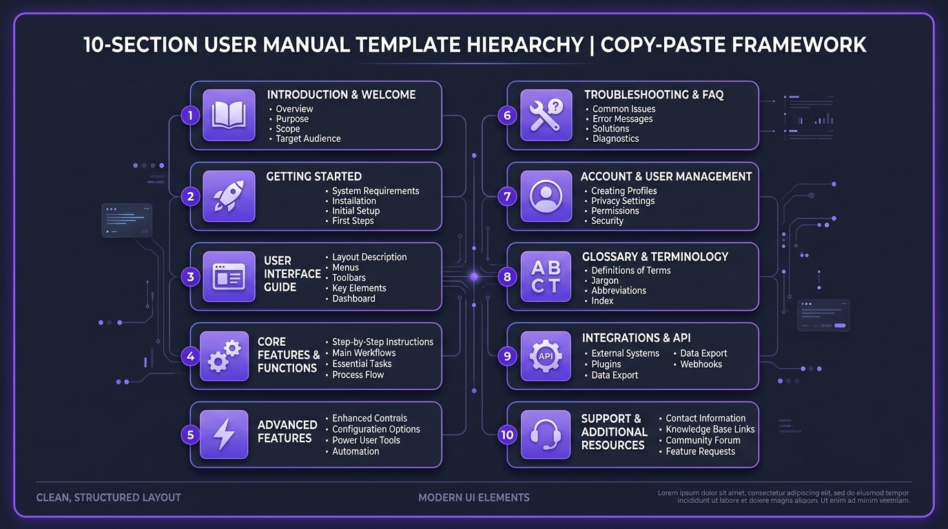
Copy this, delete what doesn’t apply, and fill it in. It’s the skeleton I use as a starting point.
[PRODUCT NAME]: User Manual
Version: X.X | Last updated: [Month Year] | Document owner: [Name/Role]

1. About This Manual
   1.1 Who this manual is for
   1.2 What you'll be able to do
   1.3 How to use this document
   1.4 Symbols, icons, and conventions used

2. Safety Information
   2.1 Severity levels explained (Danger / Warning / Caution / Notice)
   2.2 General safety precautions
   2.3 Residual risks

3. Product Overview
   3.1 What's in the box / What's included
   3.2 Labelled parts diagram
   3.3 Technical specifications
   3.4 System or environmental requirements

4. Quick Start
   4.1 Fastest path to first working result
   4.2 How to confirm it worked

5. Setup and Installation
   5.1 Before you begin: prerequisites
   5.2 Step-by-step installation
   5.3 Initial configuration
   5.4 Verification checklist

6. Everyday Operation
   6.1 [Task 1: named as the user would say it]
   6.2 [Task 2]
   6.3 [Task 3]
   (One task per section. Steps numbered. Expected result stated.)

7. Advanced Features and Settings
   7.1 [Feature]: what it does, when to use it, how to enable it

8. Troubleshooting
   8.1 Symptom index (A–Z, in the user's words)
   8.2 [Symptom] → likely causes → fixes → when to contact support
   8.3 Error and status codes reference

9. Maintenance and Care
   9.1 Maintenance schedule table
   9.2 Cleaning and consumables
   9.3 Storage, transport, and disposal

10. Support and Legal
    10.1 How to contact support (and what to have ready)
    10.2 Warranty terms and coverage
    10.3 Compliance statements and declarations
    10.4 Glossary
    10.5 Index

Revision history: [Version | Date | What changed | Approved by]
The two lines teams delete first and regret later: the verification checklist in section 5 and the revision history at the bottom. Keep both.
Tools for Building User Manuals in 2026
Screen Capture and Annotation Tools
Snagit is still the default for annotated screenshots and step capture, and its automatic step-recording feature genuinely saves hours on software procedures. Scribe and Tango handle the same job by recording a workflow in-browser and generating a draft guide. For diagrams, Figma or draw.io. For hardware, get real illustrations: photographs of a device with cabling behind it never read as clearly as a clean line drawing.
Help Authoring and Knowledge Base Platforms
For software teams, docs-as-code (Markdown in Git, built with something like Docusaurus or MkDocs) gives you version control, review workflow, and diffs, which is what makes documentation survive contact with a fast release cycle. For non-technical authors, hosted knowledge base platforms like Zendesk Guide, Document360, or ProProfs are easier to adopt. For regulated hardware documentation, a component-based system with content reuse and translation memory pays for itself the first time you localise into twelve languages.
Pick based on who’s writing, not on the feature matrix.
Using AI to Draft Manuals: What It Does Well and What It Gets Wrong
Direct answer: AI drafting is good at structure, tone, and volume, and unreliable at facts about your specific product. Use it for the first draft and the rewrite pass. Do not use it for the details.
What it does well: turning an engineer’s rough notes into clean numbered steps, rewriting dense prose at a consistent reading level, generating a first-pass troubleshooting index from ticket exports, drafting translations for a human reviewer, and producing the boring connective sections nobody wants to write.
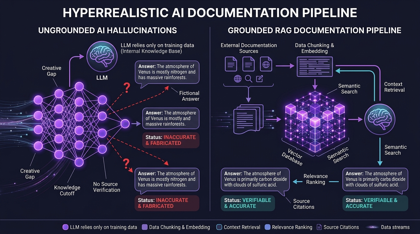
What it gets wrong, in the order I see it: invented UI labels and menu paths. The model produces a plausible-sounding path - Settings → Preferences → Advanced, which doesn’t exist in your build. It’s fluent, specific, and wrong, which is the worst combination for a manual. Next: version numbers, pricing, and capability claims stated with confidence and no basis. Then: safety-critical detail, where a generic warning gets substituted for your actual residual risk.
The fix isn’t better prompting. It’s grounding. Feed the model your actual source of truth - release notes, UI string tables, API specs, existing verified docs - and constrain it to that, which is exactly the problem retrieval-augmented generation exists to solve (to learn how autonomous AI agents evaluate and re-retrieve context, read our deep-dive on What is Agentic RAG). A grounded drafting workflow that cites its source line for every claim is usable. An ungrounded one produces confident fiction that a reviewer has to fact-check line by line, which costs more than writing it yourself.
And if you’re publishing AI-assisted documentation in a regulated category, put a human sign-off gate in the workflow and log it. That’s the sort of control an AI governance review exists to formalise, and it’s a lot cheaper to build in now than to retrofit during an audit.
One more thing worth planning for: your manual is increasingly not read by humans at all. It’s read by your in-product assistant, by third-party chatbots, and by AI search answering on your behalf. Documentation written as clean, self-contained, well-labelled sections performs dramatically better as a retrieval corpus than the same content in a 200-page PDF. If you’re building an in-product support agent, the quality ceiling is set by your documentation, not by your model. Ensuring low-latency delivery across global users also relies on modern infrastructure, as detailed in our analysis of what is an application acceleration manager.
Accessibility, Compliance, and Multilingual Manuals
Making Manuals Usable for Everyone
Real alt text on every diagram, describing what the image shows, not “Figure 4.” Sufficient colour contrast. Never encode meaning in colour alone; the red indicator needs a label too. Proper heading hierarchy so screen readers can navigate. Tagged PDFs if you ship PDFs. Text that reflows on a phone.
In the US, Section 508 and the WCAG guidelines it references are the practical benchmark. Accessibility work also makes documents better for everyone - the same structure that helps a screen reader helps a search index.
Standards and Regulations You May Need to Meet
Three worth knowing about:
- IEC/IEEE 82079-1: the international standard for instructions for use. Useful even where it isn’t mandatory, because it gives you a defensible structure.
- ANSI Z535.6: ANSI Z535.6 safety message standard. It’s what defines the Danger/Warning/Caution/Notice hierarchy and how to place those messages.
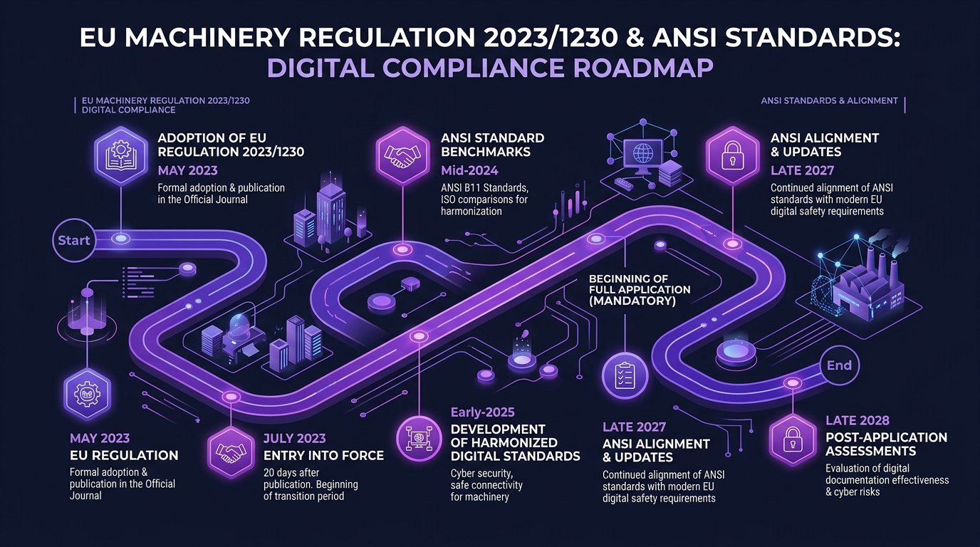
- EU Machinery Regulation (EU) 2023/1230: this is the update competitors mostly haven’t covered yet. It replaces Machinery Directive 2006/42/EC and applies from 20 January 2027. The change that matters for documentation teams: instructions for use can be supplied digitally by default, with paper required only if the user requests it at purchase, or for non-professional users. Digital manuals must be downloadable and available on request in paper for the product’s life cycle, with at least a ten-year retention obligation on technical documentation. Learn more at EU Machinery Regulation (EU) 2023/1230.
If you sell machinery into the EU, that date should already be in your roadmap. If you sell consumer products there, look at the General Product Safety Regulation separately. And confirm all of this with qualified regulatory counsel for your product category - standards get revised, and I’m giving you orientation, not legal advice.
Translating Manuals Without Losing Accuracy
Write the source in translation-friendly English: short sentences, consistent terminology, no idioms, no puns in headings. Build a terminology glossary before translation starts and lock it. Use translation memory so revisions don’t retranslate unchanged content.
Machine translation with human review is now the sensible default for most content, but not for safety warnings, legal text, or anything a regulator reads. Those get a qualified human translator. The cost difference is trivial against the downside.
Mistakes That Make a User Manual Useless
The ones I run into over and over:
- Organised by product structure instead of user tasks. The single biggest cause of unfindable answers.
- Written for the person who built it. Undefined jargon, assumed context, skipped “obvious” steps.
- Troubleshooting indexed by cause. Users search symptoms.
- No verification steps. The reader finishes and doesn’t know whether it worked.
- Screenshots two versions out of date. Worse than no screenshot, it makes the user think they’re in the wrong place.
- Warnings collected in a front block rather than placed at the hazardous step.
- No owner, no revision history, no update cadence. The manual becomes archaeology.
- PDF as the only format for a product with a screen.
- Inconsistent naming: the same feature called three things across the document, the UI, and support macros. This quietly destroys search, both yours and any AI assistant reading your docs.
- Never tested on a real novice.
How to Tell If Your User Manual Is Actually Working
Pageviews tell you nothing. Four measurements that do:
Support ticket deflection, measured properly. Not “did traffic go up”, instrument whether a user viewed documentation before filing a ticket, and which article. That gives you a per-article deflection signal instead of a vanity number. Tag incoming tickets against the section that should have prevented them.
Internal search queries, especially zero-result queries: This is the highest-value dataset in your documentation stack and almost nobody reads it. Your zero-result and low-click queries are a ranked, self-updating list of content gaps written in your users’ actual vocabulary. I treat it as a bug tracker for docs. For reviewing digital search APIs and zero-result search performance, see our deep-dive on Best API Search Company’s Homepage.
Page-level exit rate paired with time on page. High exit plus very short time means they didn’t find it. High exit plus a long dwell means they found it and left satisfied. The combination is what’s informative: either metric alone will mislead you.
A feedback widget with a free-text box. “Was this helpful?” thumbs give you a signal; the free-text field tells you why. Read them weekly. They’re blunt and extremely useful.
Once you have a few quarters of this instrumented, the next step is joining ticket volume to release events and documentation changes to see which docs actually move support load - the kind of question predictive analytics work answers well, and it turns your documentation budget conversation from opinion into evidence. Getting there depends less on modelling than on plumbing: ticket exports, search logs, and doc analytics landing in one place, which is ordinary data engineering work most teams skip.

User Manual Examples Worth Studying
Physical Product: IKEA
Almost no words. Sequential visual steps, consistent iconography, explicit part counts before assembly begins, and a clear “you need two people for this” indicator. Whatever you think of the furniture, the instructional design solves an extremely hard problem: one document, dozens of languages, no translation. Study how much they encode in the drawing itself.
SaaS: Slack Help Centre
Task-titled articles in user language (“Send a message,” “Manage notifications”), short self-contained pages, screenshots with callouts, platform toggles for desktop and mobile, and answers that start immediately without a preamble. It’s a strong model for how to structure software documentation for both human scanning and machine retrieval.
Enterprise Software: ManageEngine
Dense, version-specific, and organised for administrators who know what they’re looking for. It shows a legitimate alternative approach: when your reader is technical and repeat-visiting, precision and completeness beat friendliness. Note the trade-off it accepts: a first-time user would struggle. That’s a deliberate choice, not an accident.
Frequently Asked Questions
What is user documentation?
User documentation is any content created to help end users successfully use a product: user manuals, user guides, instruction manuals, quick start guides, knowledge base articles, and in-product help. It differs from internal technical documentation, which is written for developers and engineers rather than customers. The defining test is the audience: if it exists to help someone use the thing rather than build it, it’s user documentation.
What should every user manual include?
At minimum: a table of contents, a version number and date, an introduction naming the intended reader, safety information where relevant, a product overview with labelled parts, setup instructions, core operating procedures, a troubleshooting section indexed by symptom, maintenance guidance, and support contact details. A glossary and an index become necessary past roughly thirty pages. Everything else depends on your product category and regulatory obligations.
How long should a user manual be?
As long as it takes to cover the tasks users actually perform, and no longer. Length is the wrong target entirely: findability is. A well-indexed 120-page manual can be faster to use than a 20-page one with vague headings, because nobody reads either one linearly. If you want a heuristic: every section should map to a real question from your support data. Sections that don’t, cut.
Who writes the user manual: the product team or a writer?
Best results come from a technical writer who interviews the product team, rather than either working alone. Engineers know what’s true but suffer from the curse of knowledge - they skip steps that feel obvious. Writers catch those gaps but can’t invent accurate detail. Small teams without a dedicated writer should assign a named owner and pair them with an engineer for review. Unowned documentation goes stale within two quarters.
What’s the difference between a user guide and an instruction manual?
A user guide is usually task-oriented and shorter, helping someone accomplish a specific goal, and it’s common in software and SaaS. An instruction manual is typically product-oriented and leans on assembly, safe operation, and diagrams, and it’s common with physical consumer goods. In everyday usage the terms overlap heavily and are often used interchangeably. The distinction matters most when regulatory language specifies a particular document type.
Do user manuals need to be legally compliant?
For many product categories, yes. Machinery, electrical goods, medical devices, toys, and chemicals all carry documentation obligations that vary by market. In the EU, the Machinery Regulation (EU) 2023/1230 applies from 20 January 2027 and sets requirements for instructions for use, including the conditions for supplying them digitally. In the US, safety-message formatting typically follows ANSI Z535.6, and public-sector accessibility follows Section 508. Confirm your specific obligations with qualified regulatory counsel - this is orientation, not legal advice.
What I’d Do If I Were You
Start with your support data, not with a blank template. Export the last six months of ticket subjects and your internal search queries, rank them, and let that ranked list become your table of contents. Write the top ten answers properly (self-contained, symptom-titled, with a verification step) before you write anything else.
Then do the one thing almost everyone skips: hand it to someone who’s never seen the product and watch them fail. Fix what you see. That single session will teach you more than another week of writing.
And if your documentation is going to feed an in-product assistant or an AI search surface, structure it for retrieval from day one. Retrofitting a 200-page PDF into a usable knowledge corpus costs far more than writing it in clean sections the first time; that’s the most consistent lesson from the AI systems work I do, and it’s the mistake I’d most want to save you from. If you’re not sure whether your existing docs are in good enough shape to support that, an architecture and readiness review will tell you in a few days what a failed chatbot launch would tell you in a few months.